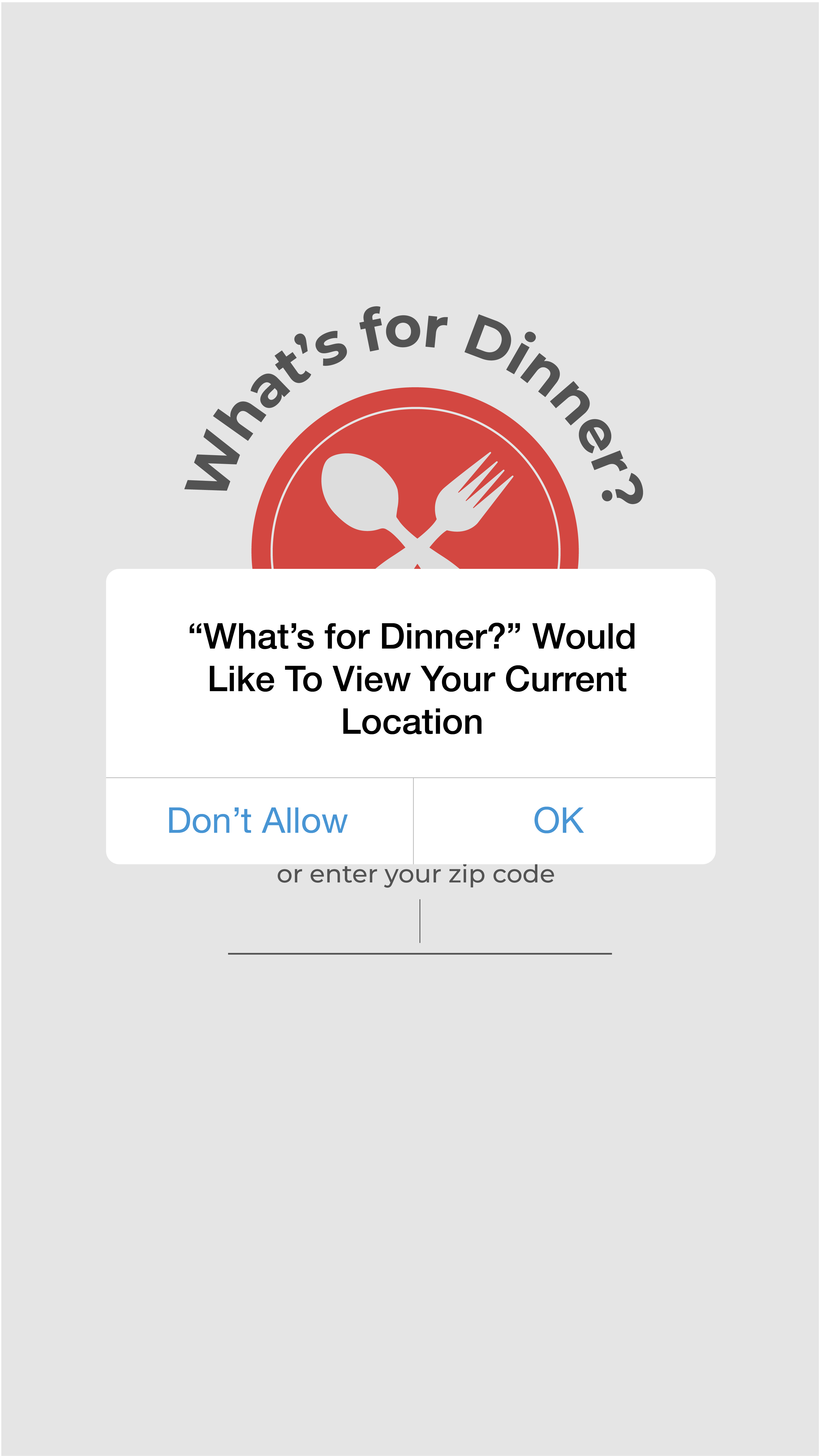
What's For
Dinner?
WHAT IS THE PROBLEM?
Let's face it. We've all argued about where to eat at some point in
our lives. Picture this: You and some friends decide to spend the day
together. Now it's lunch time, and you decide to ask the question: "So
where does everyone want to eat?" The abundance of choices makes it
more difficult to choose a place to eat at. So, the question was: How
might we improve the way users choose a place to eat that comes as a
delight, while keeping it simple and efficient?
RESEARCH
1. User Journey Map
We came up with user journey maps of what the user goes through when
using a similar app. We found that each application offers options
to narrow choices, shows food prices along with other helpful information,
and it is easy to navigate overall.
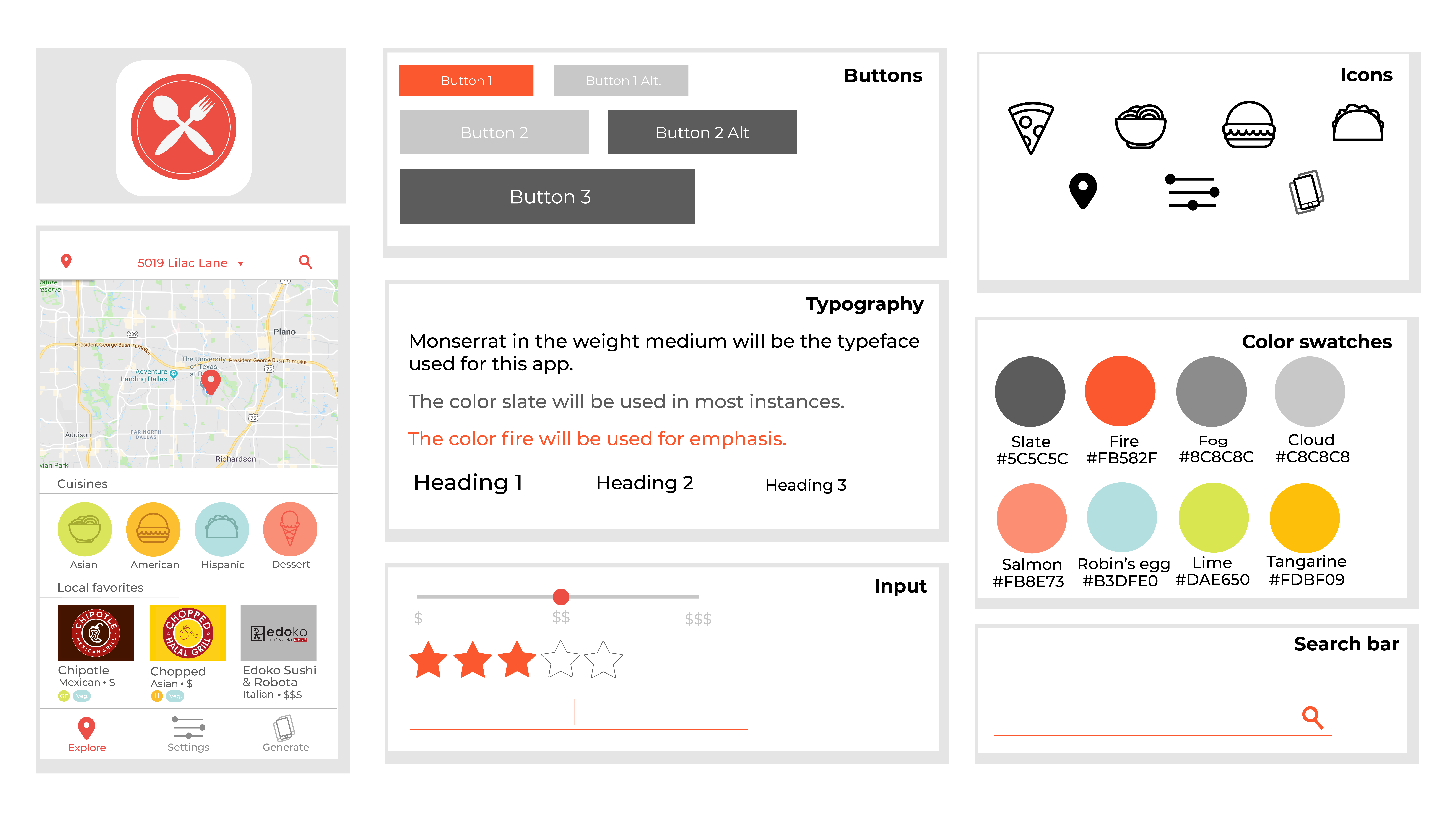
2. User Interface Kit
One of the first things we noticed was most of
the applications were red or orange. It makes sense because the color
red makes people more hungry, so we decided to use red for our main
color.
We wanted to keep the application simple and decluttered, so we opted to
use simple line illustrations with a white background and black text for
contrast.
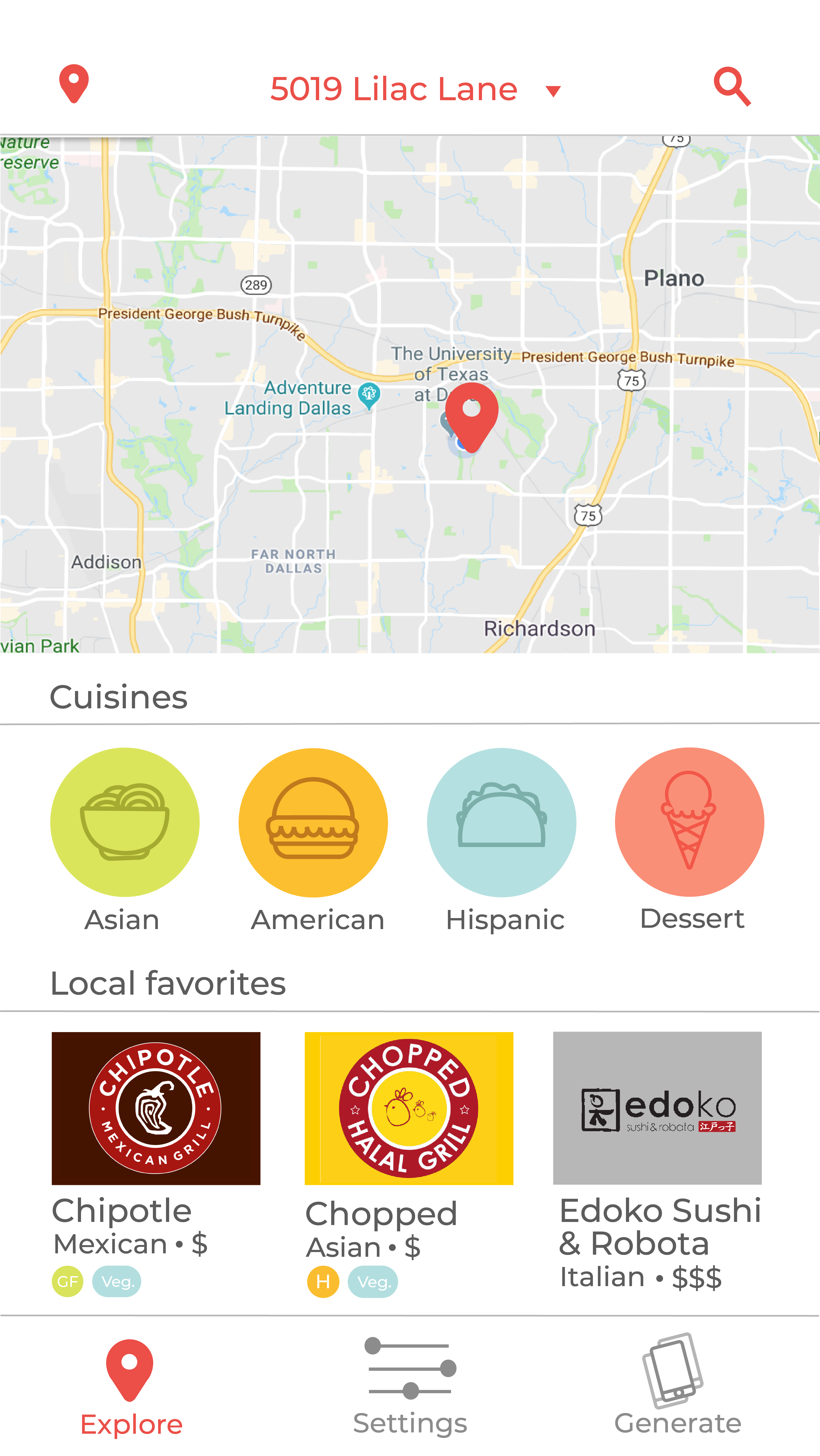
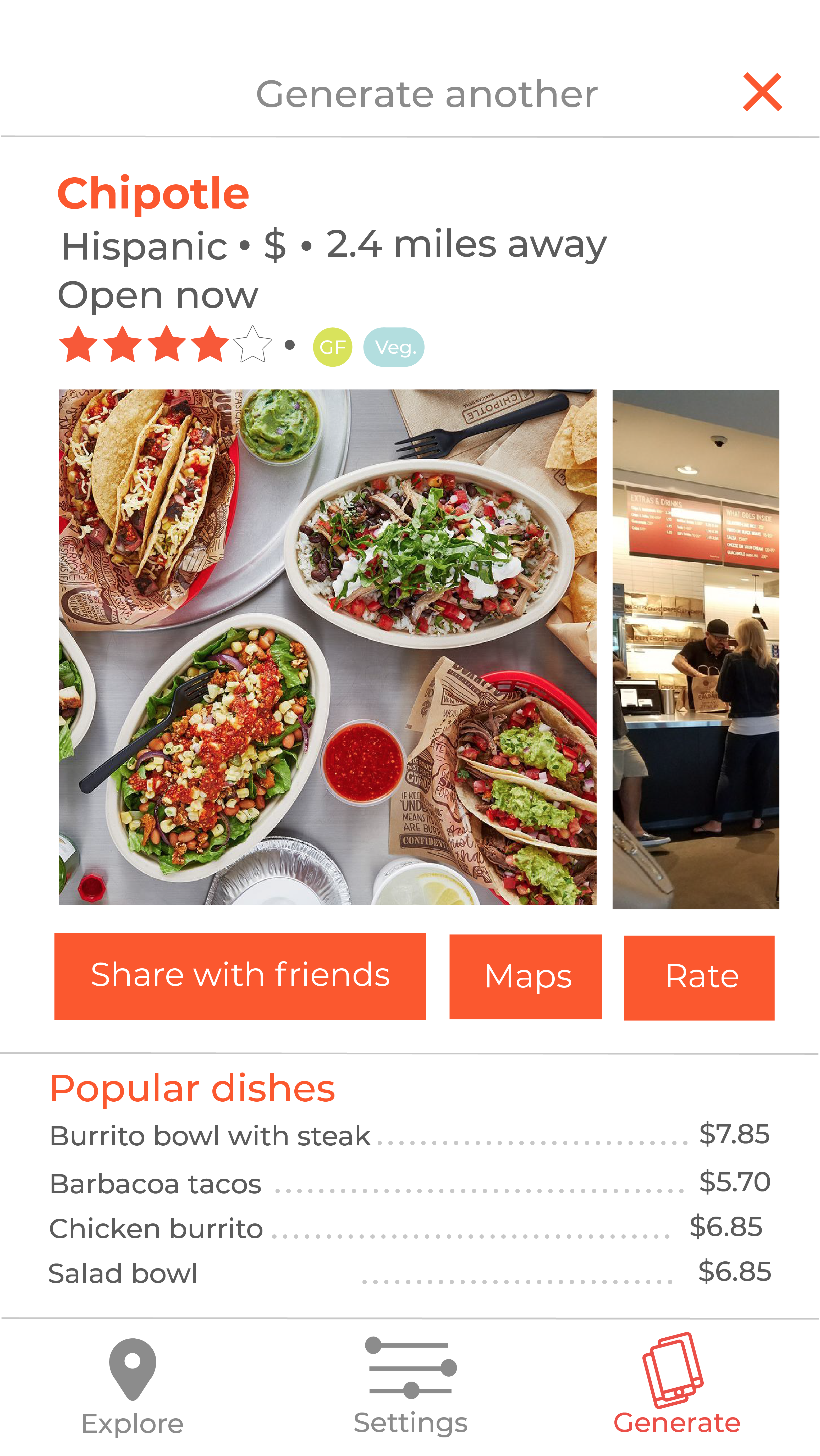
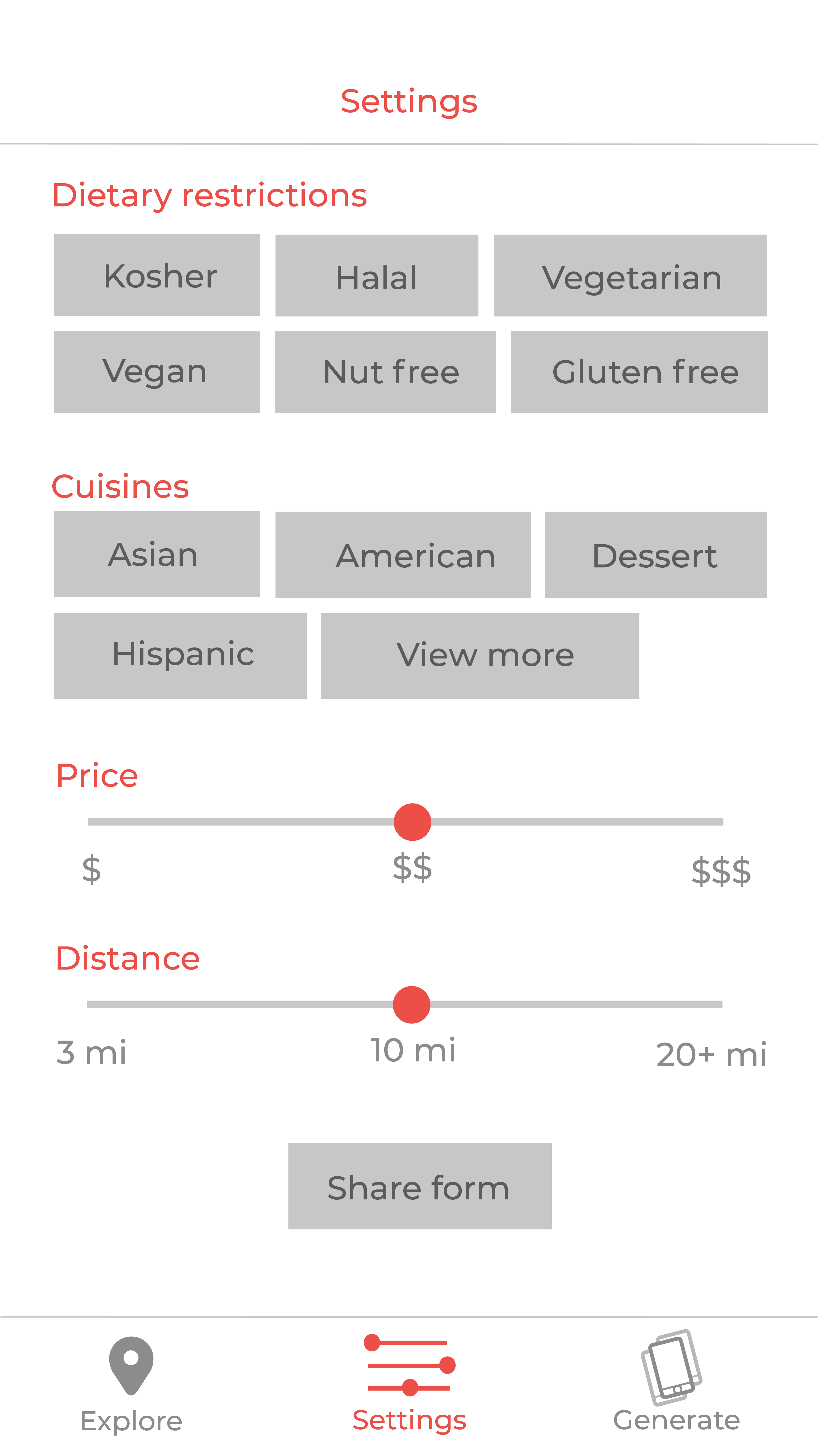
FINAL SCREENS
